Rendering a UI
Rendering ANSI through STDOUT
When a plugin's render function prints to STDOUT, Zellij treats the printed bytes as utf-8 ANSI. One can print to a Zellij plugin just like one could print to any terminal and have it rendered, with the following exception:
Every time the render function is called, the previous state of the terminal is cleared. This is in order to facilitate UI development without having to keep track of the previous state on screen. This behavior might be toggleable in the future.
Plugin developers are free to use whichever terminal UI libraries they wish in order to render a Zellij plugin. In the future Zellij might offer a UI library of its own as well as an integration with a few popular ones.
Using the Built-in UI Components
Zellij provides plugins with some built-in UI components that will fit the user's theme and preferences. These are cross-language components, interpreted through serialized STDOUT in the render function as a private terminal DCS extension. The various plugin SDKs provide wrappers to facilitate serialization. All of these wrappers should be used inside the render function
The Components
Table
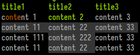
Consists of a title line with an emphasis style and a grid of width-justified cells. Each cell can be styled individually (see Text below) and also marked as "selected". Marking adjacent cells as selected can create a "selected row" effect.
Example from the Rust SDK (renders the screeshot above):
#![allow(unused)]
fn main() {
let table = Table::new()
    .add_row(vec!["title1", "title2", "title3"])
    .add_styled_row(vec![Text::new("content 1").color_range(0, 1..5), Text::new("content 2").color_range(2, ..), Text::new("content 3")])
    .add_styled_row(vec![Text::new("content 11").selected(), Text::new("content 22").selected(), Text::new("content 33").selected()])
    .add_styled_row(vec![Text::new("content 111"), Text::new("content 222").selected(), Text::new("content 33")])
    .add_styled_row(vec![Text::new("content 11"), Text::new("content 22").selected(), Text::new("content 33")]);
print_table(table); // will print this table wherever the cursor may be at the moment
print_table_with_coordinates(table, 4, 5, None, None); // will print this table at x: 4, y: 5, the last two `Option`s are width/height
}
Ribbon

Ribbons are the UI elements used for tabs in the Zellij tab bar and for modes in the Zellij status-bar. They can be selected, which would change their background color, and can contain styled text themselves (see Text below).
Example from the Rust SDK (renders the screenshot above):
#![allow(unused)]
fn main() {
print_ribbon_with_coordinates(Text::new("ribbon 1").color_range(0, 1..5), 0, 0, Some(12), None);
print_ribbon_with_coordinates(Text::new("ribbon 2").color_range(1, 1..5).selected(), 12, 0,  Some(12), None);
print_ribbon_with_coordinates(Text::new("ribbon 3").color_range(2, 1..5), 24, 0, Some(12), None);
print_ribbon_with_coordinates(Text::new("ribbon 4").color_range(3, 1..5), 36, 0,  Some(12), None);
}
Nested List
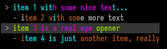
A nested list is the UI element used in the Zellij session-manager. It is a list with possibility indented lines to an arbitrary level. Each line can be selected (multiple lines can be selected as well), and each line can be styled individually (see Text below).
Example from the Rust SDK (renders the screenshot above):
#![allow(unused)]
fn main() {
print_nested_list_with_coordinates(vec![
    NestedListItem::new("item 1 with some nice text...").color_range(1, ..).color_range(3, 10..25).color_indices(1, vec![8]),
    NestedListItem::new("item 2 with some more text").indent(1).color_range(0, 1..15).color_indices(1, vec![8]),
    NestedListItem::new("item 3 is a real eye opener").color_range(2, ..).color_range(3, 5..20).color_indices(1, vec![8]).selected(),
    NestedListItem::new("item 4 is just another item, really").indent(1).color_range(0, ..).color_range(1, 1..15).color_indices(1, vec![8]),
], 1, 1, None, None);
}
Text

While this element can be rendered on its own, it's mainly used inside other elements for styling.
A Text element can be selected - which will be interpreted in the context of the element it resides in, generally changing its background in one way or another.
A Text element can also have indices. These indices can be one of 4 colors (preset depending on the user's theme) assigned to characters or ranges inside the element. This can be especially useful when incorporated with fuzzy finding.
Example from the Rust SDK (renders the screenshot above):
#![allow(unused)]
fn main() {
let text = Text::new("foo bar baz").selected().color_range(0, 0..=2).color_range(1, 3..=5).color_range(2, 7..=9);
print_text_with_coordinates(text, 0, 0, None, None);
}
The Protocol
Note: This section discusses the private DCS ANSI serialization protocol used to represent the above components. It could be of interest to SDK authors, but plugin developers are encouraged to use the SDK abstractions instead.
An example component can look like this: (<ESC>, represents the escape character)
<ESC>Pzribbon;27,91,49,109,60,27,91,51,56,59,53,59,57,109,110,27,91,51,57,59,51,56,59,53,59,48,109,62,32,82,69,83,73,90,69<ESC>\
The first part of the sequence, <ESC>Pz is the DCS representing the beginning of a Zellij UI element, followed by the clear-text element name. Following is a semi-colon (;) separated list of items to be interpreted according to context. In the above case there's only one item representing a utf-8 encoded byte-string which is the ribbon's contents (the bytes separated by commas). Finally, the string terminator <ESC>\ representing the end of the UI element.
Coordinates
Each component can have an optional coordinates string, placed as the first element in the semi-colon separated list directly after the component name. Example:
<ESC>Pzribbon;2/2/10/5;114,105,98,98,111,110,32,49<ESC>\
Here, the coordinate string 2/3/10/5 instructs us to render the ribbon at x: 2, y: 3, width: 10, height: 5. The width and height are optional, so may be empty (eg. 2/3//).
Selected
If a utf-8 separated byte list begins with a clear-text x, it will be considered "selected". Eg.
<ESC>Pzribbon;x114,105,98,98,111,110,32,49<ESC>\
Opaque
If a utf-8 separated byte list begins with a clear-text z (note: must follow Selected is both are present), it will be considered "opaque". Eg.
<ESC>Ptext;z114,105,98,98,111,110,32,49<ESC>\
This indicates that the UI component should use an opaque background, defaulting to the user's black theme color. Otherwise it will be considered transparent and use no background (when possible).
Opaque components are best used as part of status bars, transparent components when one wishes to represent bare text (for example, in help text).
Indices
A utf-8 separated byte list can be preceded by a dollar ($) separated index list representing colored indices. Each element within the dollar separated list can contain zero or more indexes (separated by commas) which will be colored in the desired index color (the colors themselves being determined by the user's theme).
Example:
<ESC>Pzribbon;2/2/10/;1,2,3,4$5,6$$7$114,105,98,98,111,110,32,49<ESC>\
Here, indices 1, 2, 3 and 4 will be colored in index color 0 while 5 and 6 will be colored in index color 1. Index color 2 is empty, so no elements will be colored using it, and element number 7 will be colored in index color 3.
Indentation
In the context of a Nested List, elements can be arbitrarily indented. This is done one or more pipe (|) characters preceding the utf-8 byte list.
Example:
<ESC>Pznested_list;105,116,101,109,32,51;|105,116,101,109,32,52;||105,116,101,109,32,53,32,108,115<ESC>\
Each item in a Nested List is represented as a utf-8 byte array separated by semicolons. Here, the first item will not be indented, the second item will be indented once, and the third item will be indented twice.